OpenShift.com – Now With R and rpy2

A couple of weeks ago, I announced successfully installing and running R/rpy2 on OpenShift.com

Now, you can grab the installation process and bits for yourself* through github.

http://github.com/emorisse/ROpenShift

*I’d prefer (and will be thankful for) commits, hacks, advice, and ideas over code branches.

The Lambert Effect – Subtleties in Cloud Modeling

threemodelsAfter you’ve done all of the hard work in creating the perfect model that fits your data comes the hard part: does it make sense? Have you overly fitted your data? Are the results confirming or surprising? If surprising, is that because there’s a surprise or your model is broken?

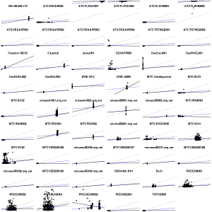
Here’s an example: iterating on the same CloudForms data as the past few posts, we have subtle variations on the relationship between CPU and memory usage shown through linear regressions with R. Grey dashed = relationship across all servers/VMs and data points, without any taking into account per server variance; and says generally more CPU usage indicates more memory consumed. Blue dashed = taking into account variance of the intercept but not slope of the variance (using factor() in lm()); and reinforces the CPU/memory relationship, but suggests it’s not as strong as the previous model. The black line varies both slope and intercept by server/VM with lmer().

So what’s the best model? Good question, I’m looking for input. I’d like a model that I can generalize to new VMs, which suggests one of the two less fitted models.

Many thanks to Edwin Lambert who, many years ago, beat into my skull that understanding, not numbers, is the goal.

Determining Application Performance Profiles in the Cloud

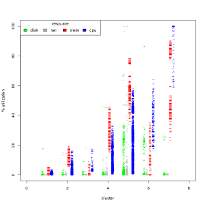
I want to know how to characterize my workloads in the cloud. With that, I should be able to find systems both over-provisioned and resource starved to aid in right-sizing and capacity planning. CloudForms by Red Hat can do these at the system level, which is where you would most likely take any actions, but I want to see if there’s any additional value in understanding at the aggregate level. cpuWe’ll work backwards for the impatient. I found 7 unique workload types by creating clusters of cpu, mem, disk, and network use through k-means of the short-term data from CloudForms (see the RGB/Gray graph nearby).  The cluster numbers are arbitrary, but ordered by median cpu usage from least to most.

From left to right, rough characterizations of the clusters are:

  1. idle
  2. light use, memory driven
  3. light use, cpu driven
  4. moderate use
  5. moderate-high everything
  6. high cpu, moderate mem, high disk
  7. cpu bound, very high memory
    Continue reading “Determining Application Performance Profiles in the Cloud”

Analyzing Cloud Performance with CloudForms and R

weeklyCloudForms by Red Hat has extensive reporting and predictive analysis built into the product. But what if you already have a reporting engine? Or want to do analysis not already built into the system? This project was created as an example of using Cloud Forms with external reporting tools (our example uses R). Take special care that you can miss context to the data, as there is a lot of state built into the product, and for guaranteed correctness, use the builtin “integrate” functionality.

Both the data collection and the analyses are fast for what they are, but aren’t particularly quick. Be patient: calculating the CPU confidence intervals of 73,000 values across 120 systems took about 90 seconds (elapsed time) on a 2011 laptop.

Required R libraries
forecast
DBI
RPostgreSQL
Installing RPostgreSQL required postgresql-devel rpm on my Fedora 14 box

See: collect.R for example to get started. Full code is available on github.

Notes on confidence intervals
Confidence intervals are the “strength” of likelihood # a value with fall within a given range. The 80% confidence interval is the set of values expected to fall within the range 80% of the time. It is a smaller range than the 95% interval, and should be considered more likely. E.g. if are going to hit your memory threshold within the 80% interval, look to address those limits before those that only fall within the 95% interval.

Notes on frequencies
Frequencies within the functions included are multiples of collected data. Short term metrics are collected at 20 second intervals. Rollup
metrics are 1 hour intervals. Example: for 1 minute intervals with short term metrics, use frequency of 3.

Notes of fields
These are column names from the CF db. The default field is cpu_usage_rate_average. I also recommend looking at mem_usage_absolute_average.

Notes on graphs
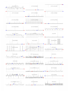
Graphs for the systems are shown for the first X systems (up to “max”) with sufficient data to perform the analysis (# of data points > frequency * 2) and that have a range of data, e.g. min < max. Red point = min, blue point = max.

Example images
*.raw.png are generated from the short term metrics. The others from the rollup data.
Load Volatility and Resource Planning for your Cloud

Having your own cloud does not mean you are out of the resource planning business, but it does make the job a lot easier. If you collect the right data, with the application of some well understood statistical practices, you can break the work down into two different tasks: supporting workload volatility and resource planning.

If the usage of our applications was changing in a predictable fashion, resource planning would be easy.  But that’s not always the case, and volatility can make it very difficult to tell what is a short term change and what is part of a long term trend.  Here are some steps to help you prioritize systems for consolidation, get ahead of future capacity problems, and understand long term trends to assist in purchasing behaviors. Our example is with data extracted from Red Hat’s ManageIQ cloud management software.

Usually, we collect and see our performance over X periods of time, where X is a small number and we don’t get much insight. More data points are help, but require a lot of storage. ManageIQ natively provides data rollup of metrics, to provide a great balance between the two.  Since we want to compare short term to long term for trends, we lose little using the rollup data.

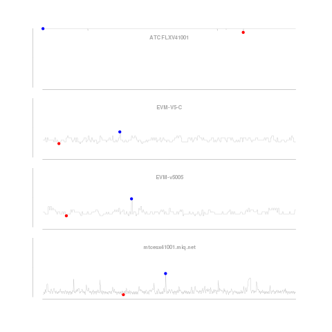
shorttermOur graphs look at the CPU utilization history of four systems. The first graph looks only at the short term data, smoothed (using a process similar to the one described here) over one minute intervals. We smooth the data to reduce the impact of intra-period volatility on our predictions. The method described corrects for “seasonality” within the periods, e.g. CPU utilization on Mondays could be predictably higher than on Tuesdays as customers come back to work and get things done they could not over the weekend. The blue dot is the highest utilization, and red, the lowest over the period. Continue reading “Load Volatility and Resource Planning for your Cloud”

Measuring Load in the Cloud: Correcting for Seasonality

youngkra2Usage is over threshold, unleash the kraken! 

Short run peaks are perfect for automated elasticity: the unpredictable consumption that we stay up late worrying about fulfilling.  But, short run peaks can be difficult to tease out from expected variation within the period: seasonality.  Using the open source statistical package R, we can separate and look at both.

Continue reading “Measuring Load in the Cloud: Correcting for Seasonality”