Anything But Random: 1,500,000 Blogs

7,100,000 Relationships Across 1,500,000 blogs

Before Google’s Social Graph API closed last month, I was able to gain access to a reasonable subset: 7,100,000 relationships across 1,500,000 sites (shown below). To be honest, it wasn’t what I was expecting.

The attach rate $latex \left(P\left(k\right) \sim{} k^{-\gamma}\right)$ is pretty close to what Barabasi, Albert, and Jeong found in Scale-free characteristics of random networks. $latex \gamma \sim{} 2.11$ across all, with $latex R^2 = 0.86$. $latex \gamma \sim{} 2.73$ for nodes with fewer than 101 attachments; $latex R^2 = 0.97$.

all nodes
nodes with 100 or fewer edges

Even though that was not much different, what clearly stood out was the sizable amount of neighborhoods. Continue reading “Anything But Random: 1,500,000 Blogs”

Maximizing Cliques

Finding largest cliques (completely connected sub-graph components) is hard. The best algorithms have run times proportional to 3^(#nodes/3). Triple the nodes = nine times the run length. So what’s a guy without a supercomputer to do but start looking for shortcuts?

Shortcut 1: Maximize for your goals

My interest is in characterizing a network, in part, through largest clique size. Since the interest is in size, not quantity, I can start looking for cliques of size N+1 as soon as I find one of size N.

Shortcut 2: Estimate

I’m interested in specific types of networks, social networks. And we can tune for that through size estimation.

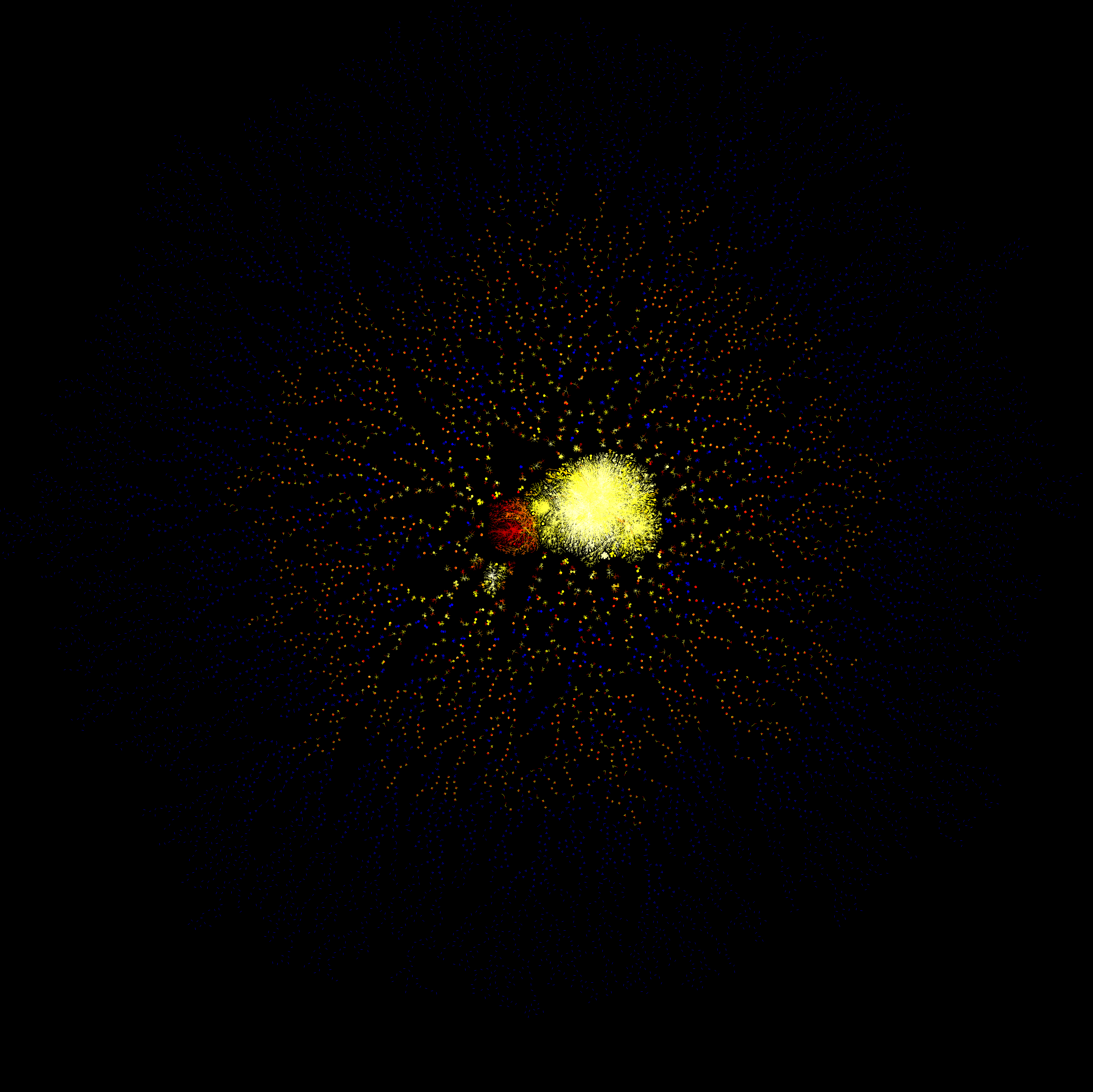
The networks I’ve run through my clique analysis are public (mailing lists, twitter feeds, etc) and generally demonstrate maximum clique size relative to number of active participants and independent of the time observed. I’ve looked at networks sampled for a week to complete observations of 10+ years of conversations.

I have only found once case where the maximum clique size was smaller than ln(# nodes)/2 for these directed networks. When artificially forcing them to undirected networks, the maximum clique size is around double.

Shortcut 3: Cleanse the Data

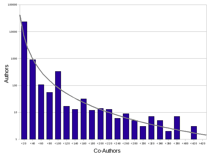
Now that I have estimated size, every node with fewer edges can be ignored. With that amounting to around (1-1/n)%, for n less than the estimated size, we can cut down the search space.

Shortcut 4: Order your Data

With looking for the largest clique, the more links a node has, the more likely it’s a member of that clique.  So, when you are selecting which nodes to start with, start with the ones with most links.  The sooner you locate larger cliques, the sooner you can stop looking for smaller ones.

Results

Here’s where the “laptop test” comes in: using just a subset of the above, I was able to locate 9-member cliques in an undirected 2,000-node 5,500-edge network in under 5 seconds.  By comparison, on the same machine, it took 5 minutes to locate them using the igraph library in R.

R’s igraph, sadly, ignores edge direction in locating cliques.  But, a run of the above using my code with edge direction completed in about 0.5 seconds.

As an example for larger graphs, I located 15-member cliques in an undirected 75,000-node 220,000-edge network in 20 hours.  R topped out in memory before reaching this size network, and was unable to complete.

Update: It’s been pointed out to me that this has scaled pretty close to n^3.

Brand Conversations and Stock Performance

About a year ago, we comparatively visualized conversations between two competitive brands of major sport apparel companies.  The network of communications of Brand A showed better potential characteristics for healthy and robust interaction.

One year later, and more than 1,000,000 people talking about each brand, what do we see?

Brand A (one year later)
Brand A

Several million conversations later, we still see a deeply interconnected pattern of communication in Brand A.  The large number of clusters are still visible, but the interconnections are less clearly visible.  Let’s compare with Brand B:

Brand B
Brand B (one year later)

Brand B began with fewer, more centralized, clusters of conversation, and less “cross talk” between them.

Again, several million conversations later, it has evolved to a larger version of what we saw before.  While there are more distinct clusters one year later in Brand B than Brand A, each of those clusters receives less input from others.  Visually, we see this distinction by the are of fewer “clear” clusters toward center of the later graph of Brand A. In other words, should something great happen, the network of communications in Brand A would foster faster and more reinforcing communication.  If you’re a marketer, that’s what you want.

So, what’s the difference in stock performance over the past year?  Brand A outperformed B by about 30%.

Palin’s Email Network

Gov Palin's Email Network (click for larger version)

Lots of cleanup left to do in the code parsing/cleaning up the emails, but here’s a first pass.  Seems like at least two connected networks, and surprisingly both the yahoo and the Gov’t email addresses are both in the larger one.  I wonder what the smaller one comprises of?

A very big thanks to the folks over at Sunlight Foundation for the data.

Comparing Online Brand Conversations (Sports Apparel)

Over a long enough period of time, maps of who is talking with whom mostly look the same.  Many conversations start to overlap with each other, and eventually you see a large central core and any number of outliers.

However if you look over short enough periods, you can see patterns of how those conversations start to merge.  And, you can tell a lot.  Easily.

Brand A
Brand B

Here we have a mapping of conversation partners mentioning two of the top sports apparel manufacturers, measured over the same period. Compare the shapes of Brand A (on left) to Brand B.

Brand B (on right) has a few larger clusters of conversation, lightly linked together by a few individuals participating in a number of the conversations.

Brand A has a lot of smaller conversations, interspersed with a handful of larger dense clusters; all webbed together in wide mesh.

So which is better?

Continue reading “Comparing Online Brand Conversations (Sports Apparel)”

Mathematicians Do It Randomly

What it look like if you took all of the Mathematics articles from JSTOR, the digital journal archive, and mapped co-authorship of the papers? It would look something like this.  Interesting to note, that while the distribution does hold to the small world network distribution exponent, there’s some “peakiness” about it that may suggest it’s not really one network, but the merging of several.  Given the role of mathematics on so many other subjects, that would not be a surprise.

JSTOR Mathematics Authors
Largest cluster of co-authorship

Zoomable image with names, after the jump.

Continue reading “Mathematicians Do It Randomly”