OpenShift.com – Now With R and rpy2

A couple of weeks ago, I announced successfully installing and running R/rpy2 on OpenShift.com

Now, you can grab the installation process and bits for yourself* through github.

http://github.com/emorisse/ROpenShift

*I’d prefer (and will be thankful for) commits, hacks, advice, and ideas over code branches.

Calculating Conditional Entropy in R


conditionalEntropy <- function( graph ) {
   # graph is a 2 or 3 column dataframe
   if (ncol(graph) == 2 ) {
      names(graph) <- c("from","to")
      graph$weight <- 1
   } else if (ncol(graph) == 3)
      names(graph) <- c("from","to","weight")
   max <- length(rle(paste(graph$from, graph$to))$values)
   total <- sum(graph$weight)
   entropy <- data.frame(H = 0, Hmax = 0);
   entropy$H <- sum(graph$weight/total * log(graph$weight/total) / log(2)) * -1
   entropy$Hmax <- log(max * (max-1))/log(2)
   return(entropy)
}


Load Volatility and Resource Planning for your Cloud

Having your own cloud does not mean you are out of the resource planning business, but it does make the job a lot easier. If you collect the right data, with the application of some well understood statistical practices, you can break the work down into two different tasks: supporting workload volatility and resource planning.

If the usage of our applications was changing in a predictable fashion, resource planning would be easy.  But that’s not always the case, and volatility can make it very difficult to tell what is a short term change and what is part of a long term trend.  Here are some steps to help you prioritize systems for consolidation, get ahead of future capacity problems, and understand long term trends to assist in purchasing behaviors. Our example is with data extracted from Red Hat’s ManageIQ cloud management software.

Usually, we collect and see our performance over X periods of time, where X is a small number and we don’t get much insight. More data points are help, but require a lot of storage. ManageIQ natively provides data rollup of metrics, to provide a great balance between the two.  Since we want to compare short term to long term for trends, we lose little using the rollup data.

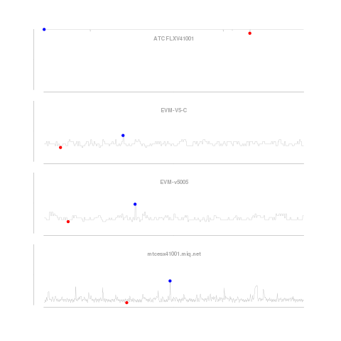
shorttermOur graphs look at the CPU utilization history of four systems. The first graph looks only at the short term data, smoothed (using a process similar to the one described here) over one minute intervals. We smooth the data to reduce the impact of intra-period volatility on our predictions. The method described corrects for “seasonality” within the periods, e.g. CPU utilization on Mondays could be predictably higher than on Tuesdays as customers come back to work and get things done they could not over the weekend. The blue dot is the highest utilization, and red, the lowest over the period. Continue reading “Load Volatility and Resource Planning for your Cloud”

Measuring Load in the Cloud: Correcting for Seasonality

youngkra2Usage is over threshold, unleash the kraken! 

Short run peaks are perfect for automated elasticity: the unpredictable consumption that we stay up late worrying about fulfilling.  But, short run peaks can be difficult to tease out from expected variation within the period: seasonality.  Using the open source statistical package R, we can separate and look at both.

Continue reading “Measuring Load in the Cloud: Correcting for Seasonality”

Internet of Things and Twine

I’ve been asked by a number of people what is this “Internet of Things?” So, here’s a draft. Where do you disagree?

What if everything could share information?

Internet of things is making sharing information simple by bringing the network capabilities of computers to anything and everything.

Who knows what will happen in uses? Maybe it’s essential that Netflix pauses when the dryer finishes it’s cycle so you know to fold laundry before it wrinkles. But, big opportunities in “quantified self, ” home automation, retail supply chain (hey, I’m expired!), medical treatment, etc.

Basically, if intercommunication is so cheap that you can collect information from everything and take action on anything, what could you do with it?

Many technical revolutions fall into two categories: look what we can do that could never be done before, and look now it’s so cheap that everything can use it. (it’s really a continuum, but that’s “crossing the chasm,” etc).

Twine is smart because they make it simple to add basic functionality in this direction to existing stuff, so lowers the barriers to get started. Since it’s a new idea, we have no idea what all of the possibilities are, they make it simple for consumers to experiment.

Medication examples :

I want my pill bottle to tell my phone to have an alarm to remind me to take the drugs when my phone recognizes I’ve walked into the cafeteria.

I want my pill bottle to keep track of how many pills I have left. I want my phone to track this and remind me to refill early because it has my calendar and sees I have a trip coming up.

I always put stuff down, and can’t find it. I want my phone to ask my home alarm system where my pill bottle is.

I remember taking a pill, but can’t remember if that was today or yesterday. My pill bottle knows.

Drugs expire, send an email.

Drugs see what other drugs are in your medicine cabinet, that are yours (not the spouses) and checks for interactions you forgot to tell your pharmacist about.

Drugs reaching limits of storage temp (power failure?), send a notification.
Health Care Leans Republican

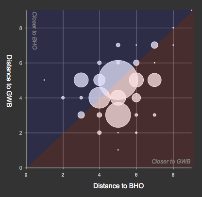
3.6-times as many former congressional staffers turned health care lobbyists and their immediate connections have network ties closer to former President Bush, than to current President Obama.

distances

The connections in the network map shown below, and used for the analysis above, include people and organizations (e.g. corporate, not-for-profit, public, etc.) the people have been identified with.

Other trivia: Continue reading “Health Care Leans Republican”

Health Care Lobbyists Part Deux

Thanks everyone for showing the strong interest in the Lobbyist map.  I got a couple nice mentions at Mother Jones and LittleSis.org, but more importantly, I’ve added in all of the other names in the map.

Circles are people, squares are organizations, and white circles are the lobbyists in question.

If you’d rather the image than the flash bits, here you go, all 2.5MB of it.

A zoomable version of the earlier map is here:

[Thanks to Drew Conway for the Sea Dragon zoomable suggestion]

Statistics::SocialNetworks Perl mod is live!

camelbookStatistics::SocialNetworks has just been uploaded to CPAN, and as it percolates through the system I put forward the question, “What are we going to do with it?”

My goal in getting a module into CPAN is easy access, and a starting point to where we can decide what tools we want, and not have to reinvent them every single time.  There’s good work beginning in R, Python, and probably lots of others, but I’m a Perl-guy and I’d like this to be an open and ongoing discussion.

Included so far, are measurements of the Burt Constraint, and the Coleman-Theil disorder index.

What would you like to see?

P.S. SNA of Iranian Gov’t

Election Influence by 527’s: Browsable Map

I wanted to put out what’s been done so far on making yesterday’s post more interactive. There’s an awful lot that could be better about this map. Particularly legibility of labels in the core (it’s just too dense). If you want to see names, I suggest looking at the edges of the map.

Michael Bommarito is looking into better layouts for legibility. And while you are waiting, I suggest getting your fill of everything he’s ever written.

The data was collected from OpenSecrets.org.

[21-Apr-2009: You should see a flash image above, but am having an awful time getting this to render on a Mac.  Works great on Linux (Red Hat Enterprise Linux).]