 After you’ve done all of the hard work in creating the perfect model that fits your data comes the hard part: does it make sense? Have you overly fitted your data? Are the results confirming or surprising? If surprising, is that because there’s a surprise or your model is broken?
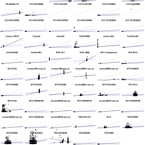
Here’s an example: iterating on the same CloudForms data as the past few posts, we have subtle variations on the relationship between CPU and memory usage shown through linear regressions with R. Grey dashed = relationship across all servers/VMs and data points, without any taking into account per server variance; and says generally more CPU usage indicates more memory consumed. Blue dashed = taking into account variance of the intercept but not slope of the variance (using factor() in lm()); and reinforces the CPU/memory relationship, but suggests it’s not as strong as the previous model. The black line varies both slope and intercept by server/VM with lmer().
So what’s the best model? Good question, I’m looking for input. I’d like a model that I can generalize to new VMs, which suggests one of the two less fitted models.
Many thanks to Edwin Lambert who, many years ago, beat into my skull that understanding, not numbers, is the goal.