R Code for Our Kid
Not to long ago, a tiny, screaming, pooping, extraordinarily amazing data manufacturing machine came into my life. Long accustom to taking subtle cues from my wife, his arrival was not a surprise; so I had plenty of time to prepare my optimal workflow for consuming baby data. Basically, I just installed Baby Connect apps on all of our devices.1
Baby Connect syncs feeding, diaper, health and all sorts of devices across multiple devices. So, when I change a diaper, I record it and can get credit for it. They also provide a number of graphs so you can see changes in the input/output of your bundle. I wanted something that would point me to changes. Fortunately, in a stroke of genius, they also allow you do download the data in CSV format from their website.2 So, with no sleep, a month of paternity leave3, and ready access to data, I started putting together some R code looking for patterns through cluster analysis.4
Feeding the Beast
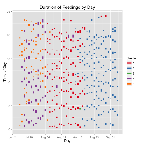
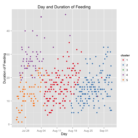
For the month and half this kid has been living with us, the model based clustering identified five clusters of feedings, when measured across the datetime, time of day, and duration of feedings.

My kiddo was eating either long or short, for the first week and a half. For the next two weeks the variation in duration of feedings came down enough to be considered a single cluster. For the next two-and-a-half weeks, the variation decrease further. The difference in feeding duration for the first fortnight is particularly noticeable in the graph below.

You’ll note I’ve discussed four clusters. The fifth has a single entry (Aug 19th, just before 5am). I have no idea what that’s about.
Long and short of it: if my kid’s like yours, you will definitively see changes to eating patterns over the first weeks.
Making Diaper Changing Cool Again
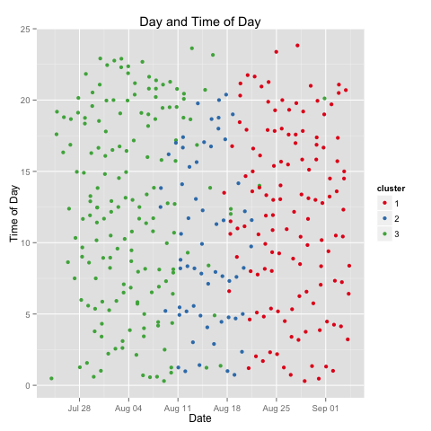
Running the similar tests over the diaper data, I calculate three clusters, and again see them largely grouped chronologically.

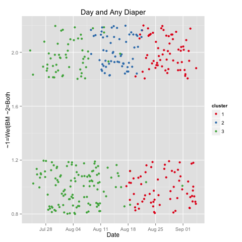
In the first, my boy went any damn well time he pleased. In the second, for a week, there’s a noticeable dropoff in quantity of diapers. In the third, quantity picks up again, but we also see the introduction of a small kindness: fewer changes after 9pm. Yes, interested parties, my boy is thankfully starting to fall into sleep patterns as well as sleep more. But, what’s going on in that middle cluster? For that, I look at the reasons for diaper changes.

This graph requires explanation (and simplification). Aside from boredom and performance art, there are two main reasons I change diapers. These two reason are often, but not always, concurrent. This graph looks at those two reasons, and tests whether they are concurrent: yes on top, no on the bottom. The Y-axis is otherwise irrelevant, and variation is in place only so the points are more readable by not all occurring in a boring line.
What we see here is my data producer had ~2/3 exclusive diapers in his first two weeks. Then mostly double diapers, for a week. And now, about an even split. Note the shift to longer feedings during the same week (second graph), this coincided with a growth spurt, not that I can tell except for looking at my calendar.
What’s Next
Please, jump in. Take a look at the code. Use the code. Provide ideas, patches, comments.