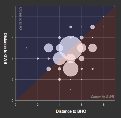
3.6-times as many former congressional staffers turned health care lobbyists and their immediate connections have network ties closer to former President Bush, than to current President Obama.
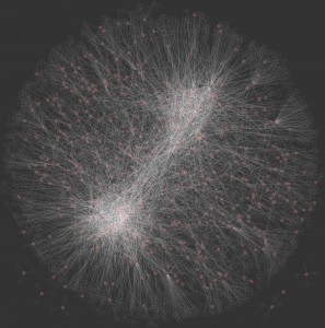
The connections in the network map shown below, and used for the analysis above, include people and organizations (e.g. corporate, not-for-profit, public, etc.) the people have been identified with.
Other trivia:
- 53% have equidistant path lengths between both Obama and Bush
- All are 0.45 links closer to Bush, on average
- Minimum distance of 6 in distance to Obama + to Bush
- Maximum difference of 4 in path lengths to Obama compared with to Bush
Expanding on the earlier network visualization of these new health care lobbyists, I have updated the network graph to the 500 identified by LittleSis.org.
The two easily identified clusters are close to Obama (lower left) and Bush (upper right). Red dots are former staffers from the LittleSis.org list, and hollow dots are their other relationships.
And, not surprisingly the relationship distribution follows a power-law. Or, as indicated in this log-scale histogram, a Poisson distribution.


Hi,
I am a Community and Regional Planning student at Temple.
What software did you use to create the network graph?
@Chris it’s been a while, but I think I used cytoscape for this one. http://www.cytoscape.org/
What is your interest in network graphing?
Thanks for the info. I did work for my professor to create a network graph of the partnering of NPOs in Phila.as they relate to food security. I didn’t use networking software which made it quite time consuming.
Sounds like an interesting project. Is it something you can share?